Overview:
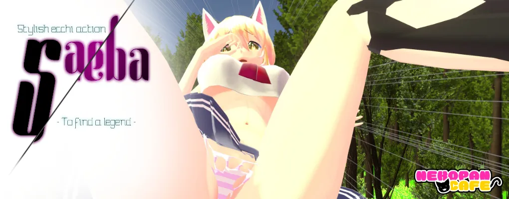
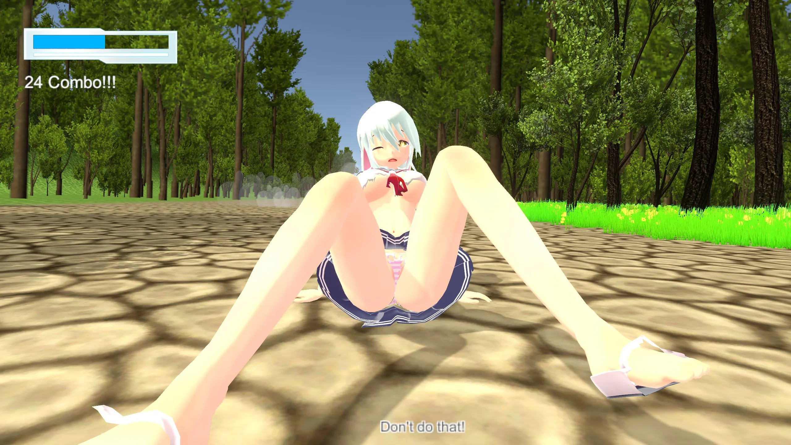
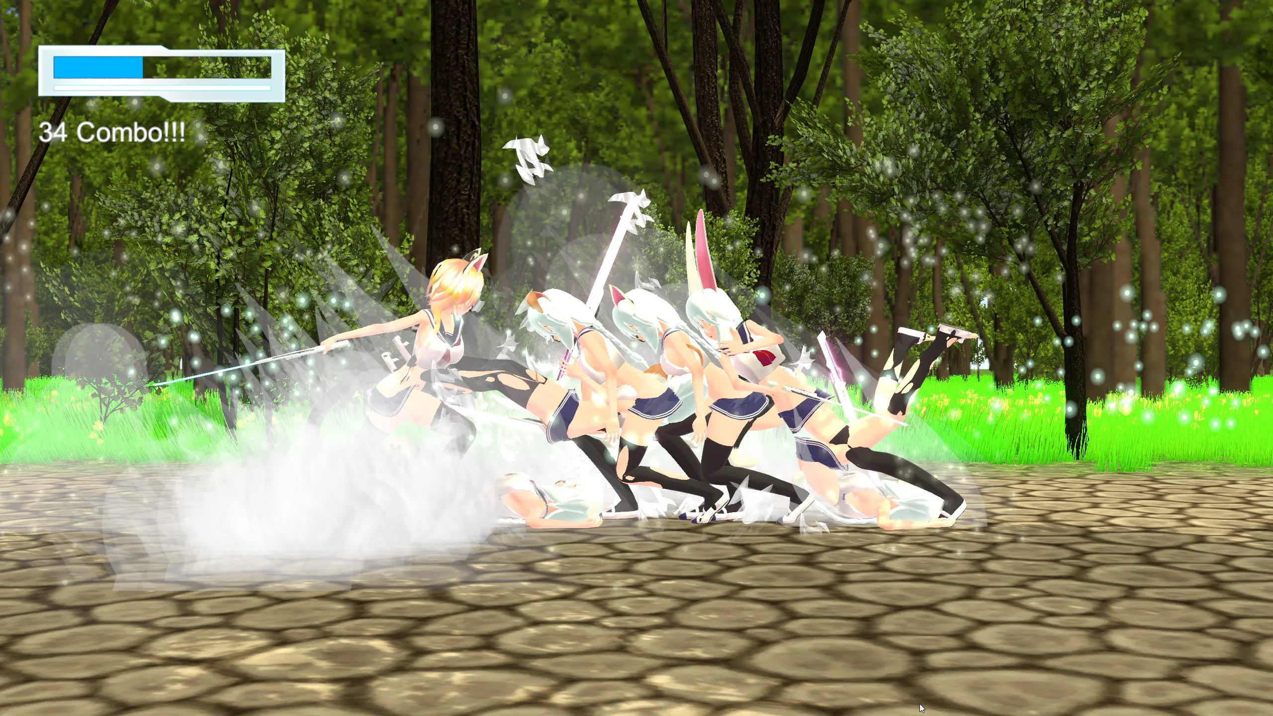
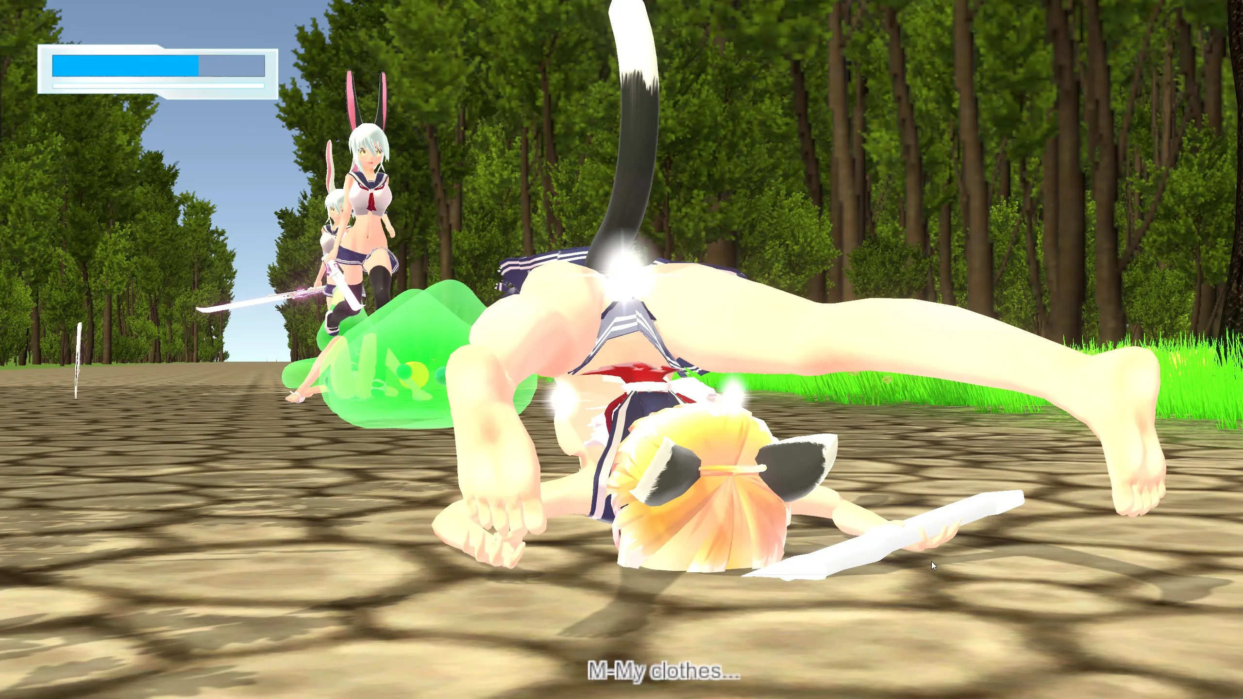
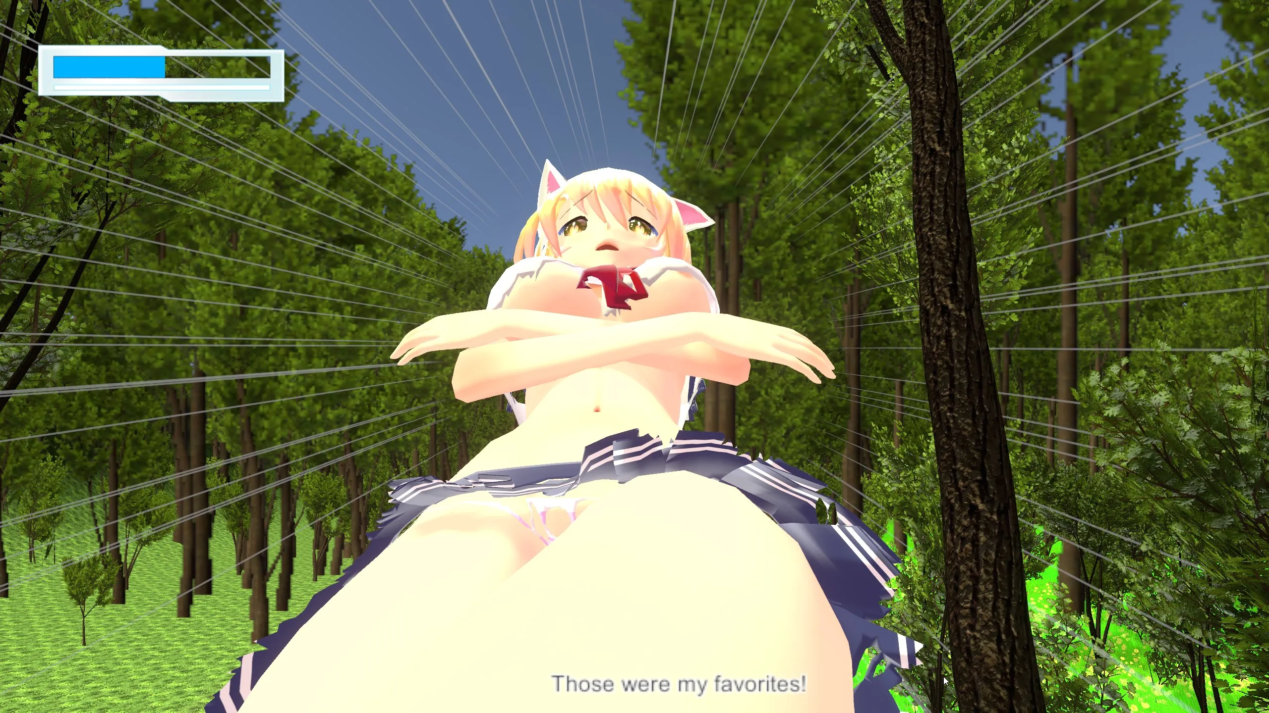
Saeba is going to be a massive stylish sidescrolling action game set on an animal ear planet, with ecchi elements similar to the Senran Kagura series. It sets out to provide a deep, fun combat experience, and ecchi elements that are expanded upon with more varied concepts than the average ecchi games being released today!
Thread Updated: 2024-11-15
Release Date: 2024-04-30
Developer: NekoPan Cafe – Patreon
Censored: Yes
Version: 1 Free Alpha
OS: Windows
Language: English
Genre:
Installation:
Changelog:
- New Paths System: Explore in more dimensions beyond just left and right. No more unnecessary platforming and nonsensical verticality!
- Revamped Forest Environment: A more visually appealing and thematic forest replaces the old one.
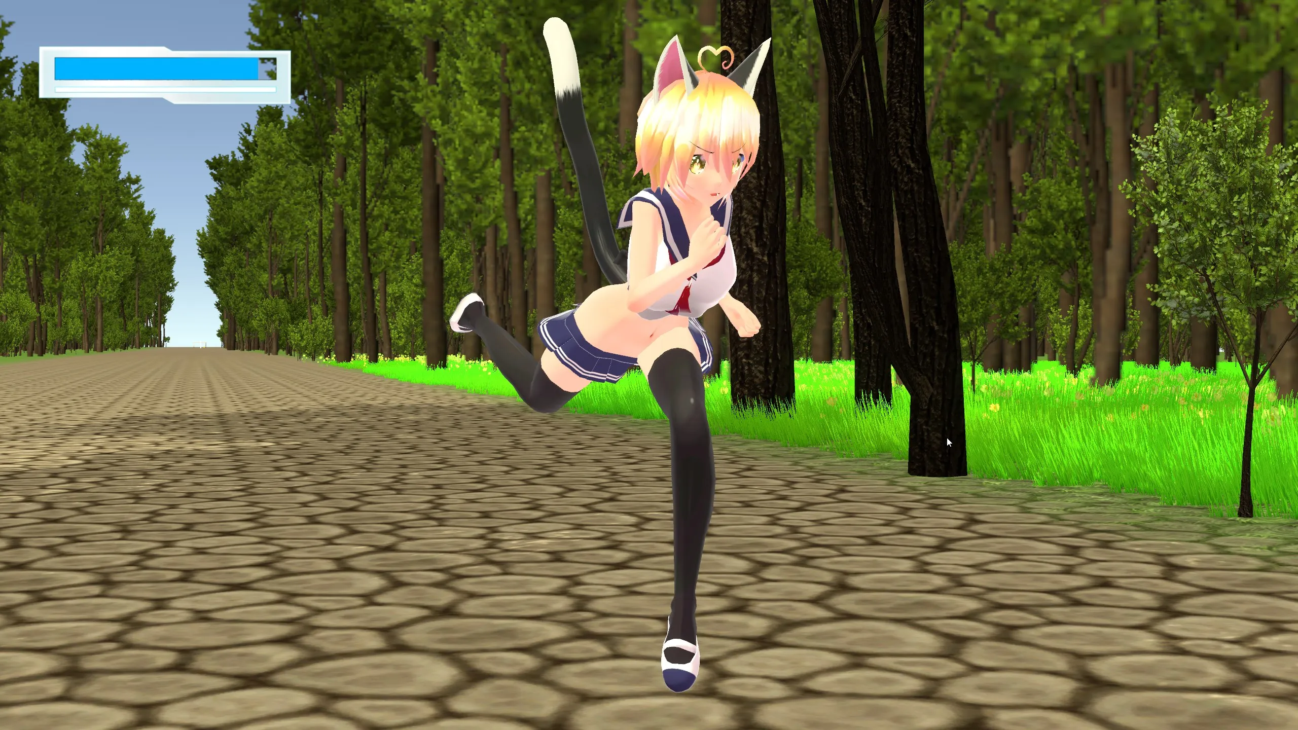
- UI Enhancements: A new life bar, mana bar, and a functional minimap to improve your gameplay experience.
- Experimental Mana Cost Changes: More actions cost mana in order to make gameplay more interesting, instead of only requiring the player to spam dodges and dashes.
- New Camera Movement: Much more natural, and doesn’t allow the player to leave its sight. It even lets you press down on your d-pad, or f on your keyboard to change your perspective!
Overhaul Part 1:
The overhaul still has more to go, so I decided to divide it into important milestones so you can play Saeba now and see how it’s changing. As I mentioned in the previous post, this overhaul started because I wasn’t happy with how the game was developing and decided I needed to make a lot of very important changes. These changes couldn’t be rushed or shown partially, so I had to take my time. When I realized the scale of these changes and how much longer they would take to complete, that’s when I decided to inform everyone that this would take a while, then continue, making sure not to rush this time.
This part of the overhaul focuses on adding the new important systems and removing the worst parts of earlier Saeba alpha versions, showing a much more optimistic vision for what I want to create. It removes unnecessary platforming, replaces the forest with a much more visually interesting and sensical one, and changes the physics and logic of the game to allow the player to move around in more ways than just left, right, and jumping.
Paths system fully implemented:
This is what I’ve wanted to implement from the beginning, but I never had time for it. The new paths system lets the player hold up or down to follow branching paths, and walk in more dimensions, rather than moving only left and right. This allows me to remove platforming where it isn’t appropriate, and design levels that look more interesting and natural. The previous versions of Saeba were made to encourage exploration, but in order to do that with a game that only allowed movement in 2 dimensions, this meant I needed to introduce what I considered to be too much verticality, resulting in very strange looking environments that I was never really happy with.
The paths system removes that limitation and allows me to make locations that are visually much more similar to games with a follow camera. And most importantly, it allows me to make locations that are much higher quality, visually and functionally. Also, it seems to remove all of the most common points of frustration players used to experience with platforming, with some testers seemingly actively enjoying the game now. Very positive!
Forest finally replaced:
As I explained in the previous post, I really did not like the previous forest in any way. It was obviously never really intended to be in the final game, but it was also kind of demotivating for me, since I didn’t have the time to replace the forest again, but I also didn’t like adding to it. And as I mentioned above, there was just way too much platforming and verticality. I needed to add that because I wanted people to eventually have the ability to explore freely, but every time I added more to that forest, the more Saeba seemed to stray from my vision for it.
This new forest is not final, and may not necessarily stay in the game as development continues and the story is written further, but thematically and functionally, it more accurately shows how Saeba will develop over time. From now on, the forest should be replaced or changed in sections, and where needed. I say should because I can’t read the future, so I can’t be 100% sure, but as the forest is now I like it a lot more than older versions, so I’m more in the mood to keep the parts that work, and simply add to it instead.
As this is only part 1 of the overhaul, most of the locations you’ll find are only visual set pieces for now, but it will be fleshed out as the game develops. There is even a secret location you can find in it with enough exploration!
Grass problem fixed:
Grass was an important part of the previous post I made, because the grass I used before was kind of terrible to look at. The grass system I showed in that post was kind of nice visually, and I was very patient with it, but the amount of work and testing I had to do to place it in such a way that it looked nice, but also didn’t completely kill FPS became too much. I did as much as I could, even making a tool that would uniformly place it automatically, and strategically in very specific areas, since the brush tool that game with the grass system for placing the grass didn’t work super well, the grass would flicker if there was too much on screen, too much of it would make the game run at very low FPS, and also too much of it would greatly increase the file size of the scene it was used in. I lost a lot of development time trying to balance and fix all of its issues, and ultimately had to give up on it.
After some searching, I found a great alternative! It does everything the other grass system did, and more, and much faster while also being very lightweight and not very demanding. It also is very easy to work with, and lets me create nice outdoor locations easily, and is more flexible. I’m very happy with it! I’ve only needed to develop one thing for it, and that’s a script that will flatten the grass when the main character walks on it or falls down in it, then unflattens at the right time.
Experimental Mana Cost Changes:
There are some experimental changes to mana in this version of the game, because I wanted to give the player more decisions to make, rather than only press dodge the entire time, or spamming the dash button to get around faster. I want mana to be a resource the player actively thinks about, so I added mana costs to dodging and dashing. You also gain your mana back if you are knocked down and get up normally. These are all experimental changes, but I’ve watched people play and these changes seem to make the game more interesting for them.
New UI stuff:
The in game UI is something else I never had time to replace before. That extremely basic one has been there since the first days when I started developing this game in unity. It wasn’t important enough to change back then, but the longer it stayed in the game, the more I wanted to get rid of it. I’m very happy and satisfied that I was finally given time to give the game just a little more visual style with this new life bar and mana bar (and experimental 3rd bar that isn’t implemented yet).
Also, now that players can move in more than 2 dimensions, a minimap finally became necessary, which also adds a certain amount of completeness to the overall visual design of the game. It was very interesting and fun drawing the temporary main character’s portrait for it, since I quit drawing years ago. I’m happy I was able to make something passable for it.
New Camera Changes:
I’ve completely redone how the camera moves in relation to the player. The camera now naturally rotates around the main character, instead of instantly flicking to its new position each time something important happens. Also, the camera no longer lets the player leave its sight, and is closer to the main character, with a clearer and much nicer looking perspective. These improve visual quality and presentation, even if just a little bit.
Also, since the paths system was added, it now allows you to see different perspectives that were previously hidden. You can press down on your d-pad or f on your keyboard to switch the view to see in front of, or behind the main character. This may be important later!
Future Changes (What kinds of things will I try to add in part 2 of the overhaul or later parts if needed?):
For part 2 of the overhaul, I would like to focus on more visual things that need changes or replacements, such as animations models, and locations that don’t look quite right. The (patreon version only) city is still unchanged, and so are the NPC’s in it. I want to replace the entire city with one that takes full advantage of the new paths system, and the NPC’s with ones that are nicer to look at. I’ve always wanted to properly make a full UI for the entire game, so I’d like to work on that, too, and possibly a new title screen. I can properly make hairstyles in blender, but that’s time consuming work that I’ve never had time for before. I would like to do that, too, as well as replace clothing that isn’t up to visual standard, and add new ones.
Speaking of new assets, there are some monsters I have new models for that I haven’t had time to implement yet. I would like to include them too, and new locations to go to if possible.
I want to greatly improve the visual effects used in the game. I’ve had a mental image of how the newer ones could look, but I’ve decided to postpone them until the next version of Saeba, so I can properly give them the attention they need.
I’ve also been thinking about sound design and how I would like to take the proper time to consider the best way to make the sound in this game more impactful and meaningful.
v6.0.2 Free Alpha
–Tenzae: A fast monster that uses its tendrils as legs. It can dive a moderate distance to tackle mages and absorb their mana through its tongue.
–Jellyfish (temporary name): This monster uses its magical energy to hover above the ground and use electricity. It can throw the electricty in the form of a ball or create a protective barrier to keep others from getting too close!
– LOTS OF WORK DONE ON THE BODY MESH
-Hips and thighs have been carefully changed to be wider and larger without making the characters seem overweight.
-All physics changed to jiggle a lot more! The physics were too stiff before.
-Thigh jiggle added!
– All bras have been added to the clothing shop! They were forgotten before! sorry.
– Fade code rewritten! Enemies now fade properly when too close to an ecchi attack instead of staying partially visible.
– Lots of behind the scenes work, new systems, and little system rewrites to make the game work as smoothly as possible.
– Lots of minor bug fixes.
UPDATE: – One of the tenzae’s ecchi animations had the wrong start and end frame values, causing it to look strange. That has been fixed.
– The player’s attacks did not immediately end when being grabbed by an enemy, causing minor strange behavior. That has also been fixed.
Developers Notes:
Working on the body took a lot more time than expected! The edited saeba body went through soooo many iterations. I was able to streamline the process with a process I came up with using Mesh Deform, but it still took a while because each one had to be tested in game, carefully observed from many angles, and compared to earlier and later versions before I finally came to the version that appears in the game now. Plus, each time, in order to properly test each version of the body to see if they look nice within the world of Saeba, I had to also reshape all of the clothing to fit each time. This process went on for a while before I was able to move on to making the new monsters.
https://i.imgur.com/EQXPv0z.png <- each one of these is a different body, and this isn’t even half of them! The body in the red box is the original. You can probably see why it needed to be changed, but its thighs and hips are really straight where they should be curvy, which doesn’t work very well for a game like this and just looks kind of strange.
These new monsters were really fun to make, though. I’m kind of happy I could finish them before this version of saeba released, as they provide a lot to saeba overall. The gameplay (and ecchi!) is a lot more enjoyable and satisfying now or at least that’s how it feels to me! My only worry is that the people playing the free version will think they’re too difficult! I want to make a new format for the free version to be friendlier for the free players soon (I know survival mode is a bit difficult when you’re just starting out), but only when there’s enough content in the actual game to support putting more into the free version.
v1.8 ALPHA DEMO
- 4 NEW ecchi armor break animations added!
- 1 NEW ecchi attack added to human enemies
- 2 NEW outfits now available! (check developers notes about this below)
- 5 NEW hairstyles added (main character’s original braid hairstyle retired until further notice)
- Hairstylist and clothing shop now added in the city!
- The human enemies are now diverse. A system for randomly choosing between eye color and style, hairstyle and color, and outfits has been added and all human enemies use these systems for now.
- The player has been nerfed.
- ===Mana now recharges half as fast
- ===you cannot double jump while in mana overload. (if this is not fun, please tell me so I can change the values a little bit)
- ===If you spam dash, you’ll enter a recovery animation (if this is not fun, please tell me so I can change the values a little bit)
- Bunny ear logic changed. Now they stay perked up most of the time, since that looks best.
- Animal ear parts fixed. They’ll no longer be half animated/half limp (this is most apparent with the cat tail and bunny ears)
- Light slap sound effect added to ecchi defeat #1
- Falling forward animation fixed
- Enemies are now overall more intelligent.
- ===If someone’s in their way while they are chasing you, They’ll jump over and continue chasing.
- ===Human enemies now slightly more likely to use a grab attack if you’re lying down
- ===Human enemies now use faster attacks if they catch up to you while chasing (for now, this is basically their grab attacks, but later they’ll do other fast attacks as well)
- ===Human enemies now have a lot of air control, so they won’t have trouble jumping over things to get to you
- Eyebrows now won’t appear over other characters that are in front of them. I will continue to work on this.
- Jumping will no longer instantly reduce you to walking speed and then let you re-accelerate if you jump while running.
- Lots of bug fixes!!
v1.2595 ALPHA DEMO
– Enemy spawners now slowly ramp up over 10 minutes survival mode style
– Grabs have been nerfed.
–Human grabs less difficult to escape now (decreased from 40 to 20 points required to escape).
–Gel grabs less difficult to escape now (decreased from 90 points to 35 points required to escape).
– There is now a grab escape bar
– You can now skip defeat cutscenes by pressing any button
– The gel tackle no longer knocks over on hit. Instead, it raises an invisible amount of knockdown points. If the knockdown points are full, you’ll be knocked over
– Damage multiplier for the player’s clothing increased
– You can now change the controls to your liking.
– All known null pointer issues fixed. The game should be much more stable overall, but the warning will stay.
– Fixed rotation alignment when mana blade falls out of an enemy’s hand
– Helpful gameplay tips now generated on game over.
– Aerial Combo now able to be canceled by an air dash
– Game over buttons can now be clicked
There’s probably more, but these are the most important.
v1.1 ALPHA DEMO:
first release
Developer Notes:
This alpha demo does not have an in-game tutorial, so for now controls are in a text file included with the game.
It was brought to my attention that I forgot to mention the inventory and potions! To access your inventory, press start on your controller or esc on your keyboard, then choose inventory on the menu. You start out with a decent amount of potions, but you can also collect potions from enemies you’ve defeated!
Please have fun!
Win: GOFILE – MEGA – MIXDROP – UPLOADHAVEN – WORKUPLOAD
Old Version (v
6.0.2 Free Alpha)
